Mr. Founder logo

6 Atrocious Web Design

(And What We Can Learn From Them)

The Internet is full of websites that do everything from selling a product to providing information, entertainment, and news.

A lot of these websites are simple and easy to use, and they are sites that people enjoy using. There are websites with sleek designs and great graphics, and these are sites that people enjoy using as well.

However, not all websites are successful. There are websites that are not user-friendly and not good for businesses or companies.

Here are six bad examples of websites that people hate using, in no particular order.

6 Atrocious Web Design
Warnign Icon

Warning: Viewing these horrible website designs may induce headaches, vertigo, and vomiting. Viewer discretion is advised.

Patimex.com

Patimex.com

Patimex is the first entry on our list of unattractive websites. At first, there are a lot of jerky images that you have to zoom in and out of, and they are always outside of the screen frames.

Reasons for ranking the website in the category of poor design

⦁ The writing on the webpage is fading in and out, yet that is hardly the worst aspect of this website.

⦁ Then you see the tiny musical note indicating that music is playing on the webpage. Along with this insane country music playing in the background is a horrible animation of the devil roasting his satanic grandeur on a barbecue. Weird.

⦁ The Patimex logo is not clickable, missing the opportunity to let users know more about their business.

The website's navigation works well, which is probably the only thing that is good about it.

Arngren.net

Patimex.com

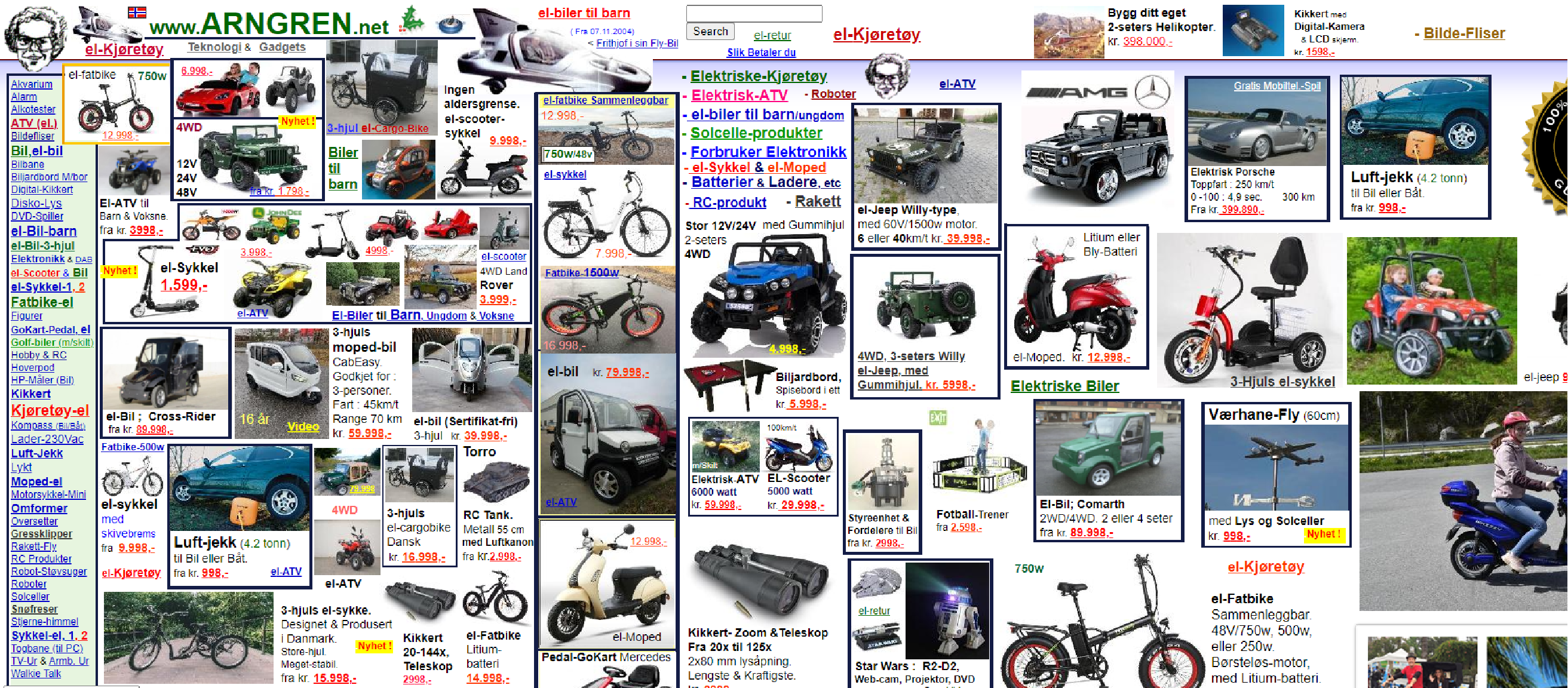
This Norwegian classifieds website defies all contemporary web design norms. This site reminds one of the horrible yellow pages that were popular in the 1990s, when advertisements competed for limited space on the page.

Reasons for ranking the website in the category of poor design

⦁ Incorrect use of color

⦁ Terrible navigation

⦁ Tiny and even perplexing typeface

⦁ The absence of a distinct corporate message

⦁ A haphazard use of color

Pennyjuice.com

Pennyjuice.com

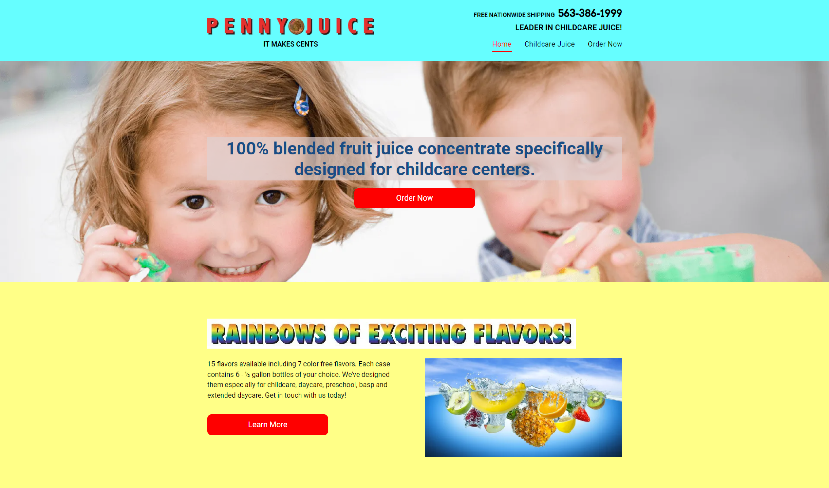
Penny Juice is a website that has failed to accomplish any website objectives, including straightforward navigation, beautiful design, and clear product descriptions.

When you first visit the website, you are greeted by a chaotic mix of bright hues. The layout makes it hard to find your way around, so you have to scroll down each page to get to the other pages.

Greatdreams.com

Pennyjuice.com

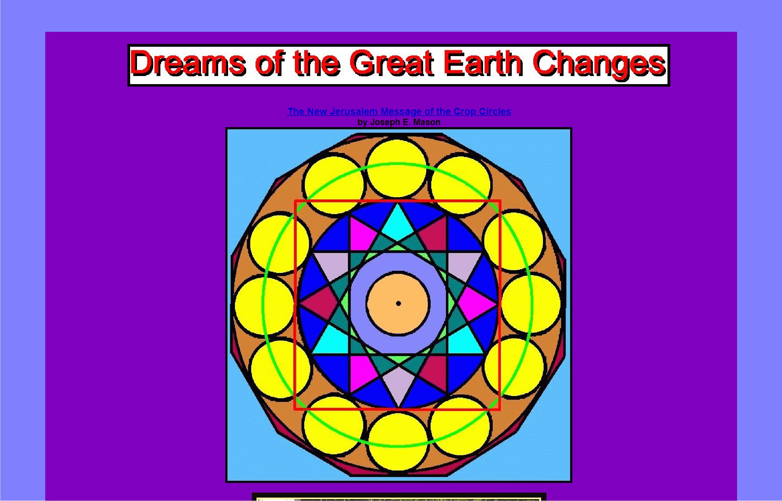
The combination of text color and background color on the Great Dreams website makes the text almost indecipherable, particularly when the text size is so small.

You land on the homepage, which is very long and tedious to the point of being unattractive. Just look at this strange warning at the top of the website:

"Please refresh your page to receive the most recent issue."

However, the most significant issue is that the website lacks a distinct theme. This site appears to be pretending to be an advanced online encyclopedia!

It will be clear that the width of the webpage has altered as you scroll down; this must be pure magic. Likewise, this website's color scheme is completely illogical.

Rudgwicksteamshow.co.uk

Rudgwicksteamshow.co.uk

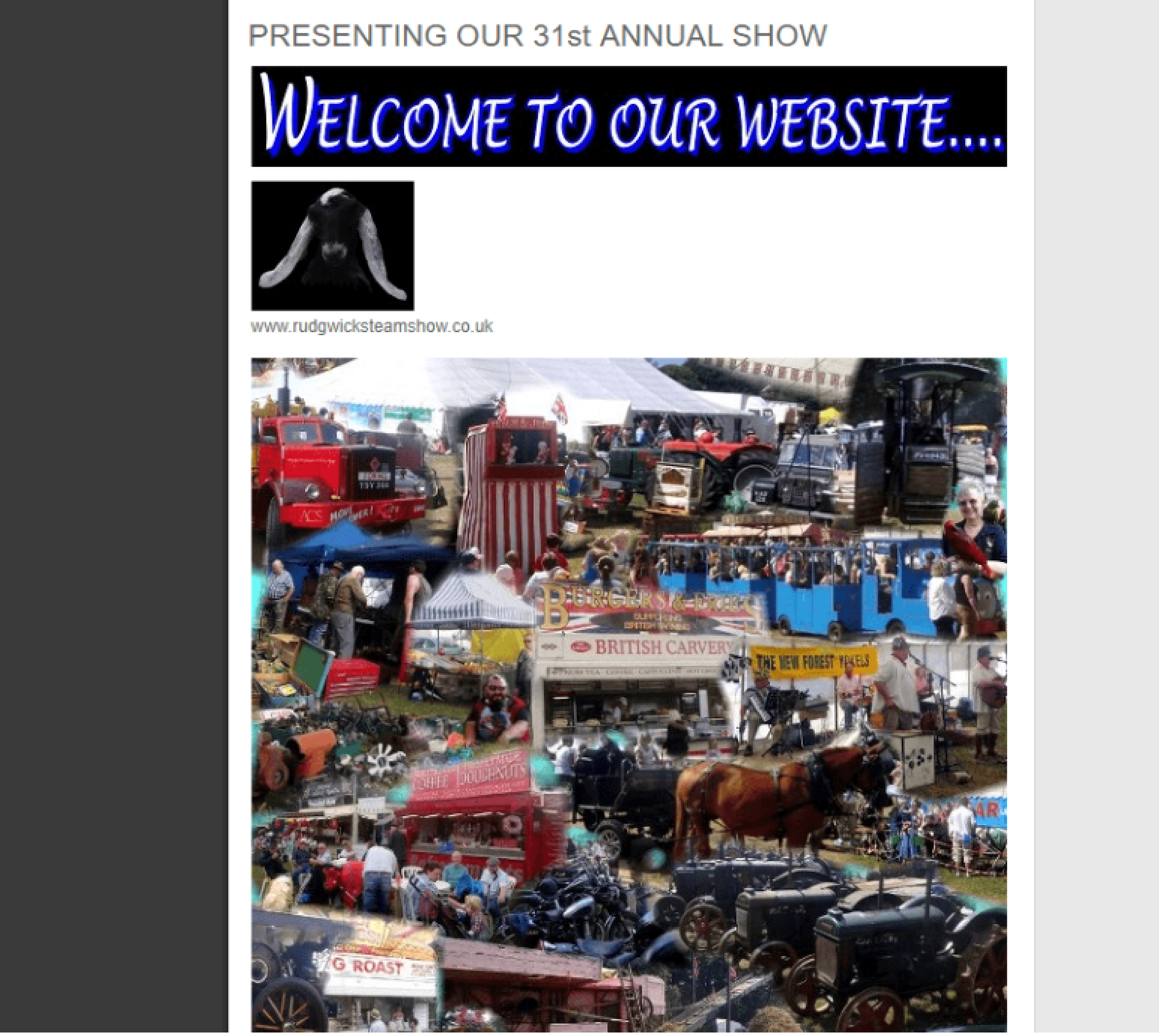
With a large collection of horrible designs, this company's website stands out even among our worst websites. When you get to the website, you don't know where to start, so you're confused.

Reasons for ranking the website in the category of poor design

⦁ Links on the navigation do not work

⦁ Strange use of colors with negative connotations

⦁ Does not provide a clear image of the webpage

⦁ Large irrelevant images

⦁ The greeting message lacks sense and significance. The whole site appears like a list!

The lack of navigability or readability contributes to the poor impression. Additionally, the links in the navigation menu are broken!

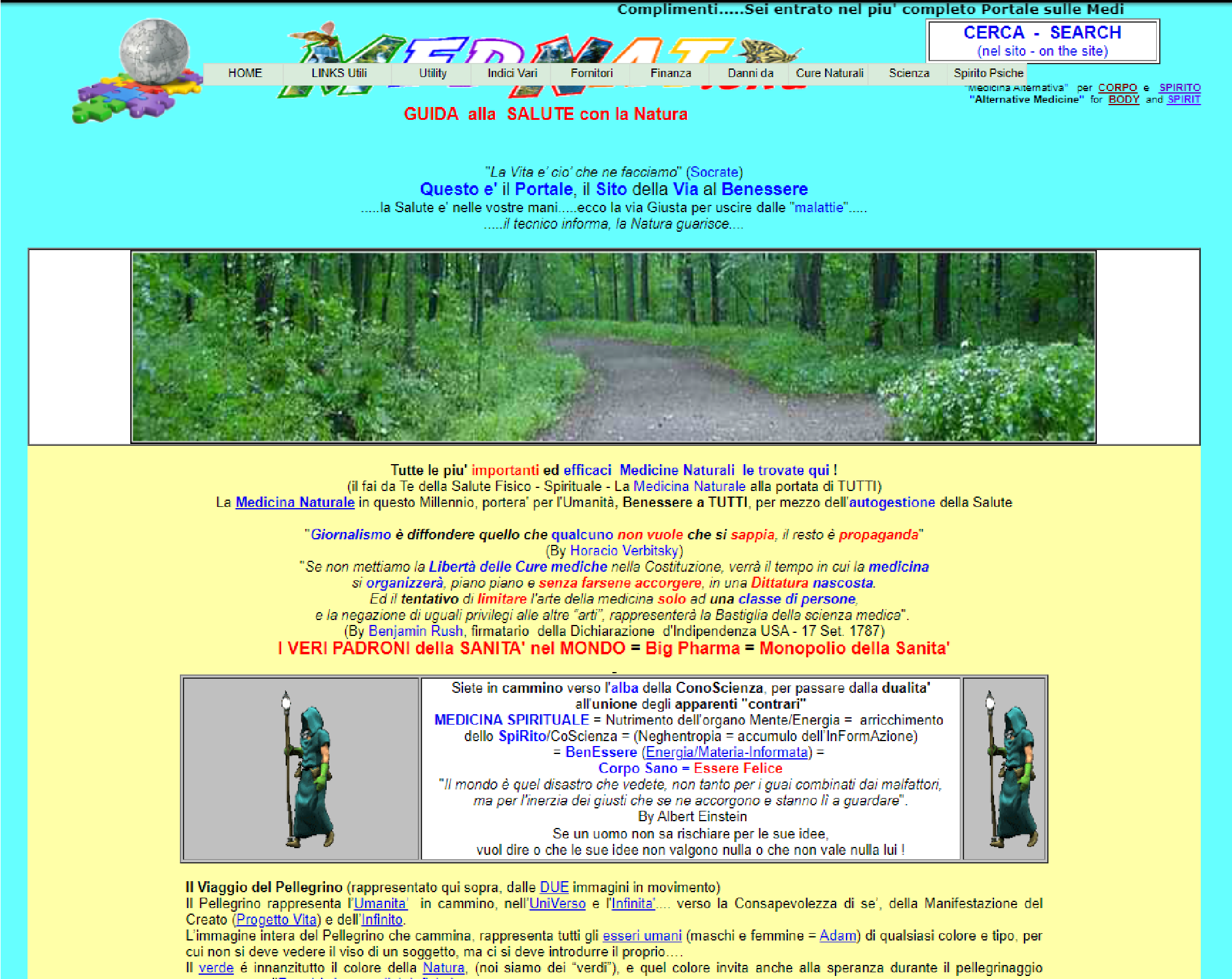
Mednat.org

Mednat.orgk

This website is a mishmash of elements that do not exactly go together. You will not comprehend its function upon landing on it. And it is just one of the issues.

The main problems with the website

⦁ Tiny font size

⦁ No structure, as there is no logical website sections

⦁ A wall of text, as one page contains enough text to fill 20 pages

⦁ No mobile response

⦁ Too many Wikipedia links

⦁ Poor usability

You will want your site to provide the best possible experience for your visitors, and that means that you need to regularly update and maintain it.

It is normal to have a website that offers something that is not very attractive to the eye, and graphics are the one thing that is the most important in making a website. They are the one thing that is going to keep people on the website and the one thing that is going to make them want to come back.

That is why you should consider hiring a graphic designer for your website.

Why hire graphic designers?

Why hire graphic designers?

When thinking about designing a website, it is important to remember the important role a graphic designer plays in the creation of a beautiful online presence.

Even if you are comfortable with the technical side of website building, graphic designers bring creative expertise and a trained eye to the table that is simply irreplaceable.

No matter what kind of website you are building, a graphic designer will be able to mold your website's aesthetic appeal to match the tone of your company and product or service.

If you are not a graphic designer, don't fret! Mr. Found3r can help you with the design of your website!

Mr. Found3r's Graphic Designers Are Heavily Vetted

Don't waste your hard earned money on graphic designers when you can go online and hire great designers from Mr. Found3r.

Mr. Found3r vets and personally interviews each potential graphic designer to ensure you receive the highest quality service. You only pay for outstanding work.

At Mr. Found3r, we offer top-notch, high-quality, and professional graphic designers to help you create the perfect design for your business.

Mr. Found3r's Graphic Designers Are Heavily Vetted

Conclusion

Your website is the first impression customers will have of your company. Make sure it's a good one!

Your website is the first impression customers will have of your company. Make sure it’s a good one! A professional graphic designer can help you create a strong and consistent visual identity for your business. This includes developing a logo, creating marketing materials, and designing your website.

Having a well-designed brand will make you look more credible and trustworthy to potential customers. If you need help getting started or want to discuss your project with an expert, book a call with Mr. Found3r today!